 There are a few things that can be your best friend or biggest nemesis in about 3.8 seconds and one of those thingamajigs is… well, landing pages.
Welcome to my quick 2 minute version of “Landing Pages for Dummies.”
Landing pages play a huge role in the success of your online marketing efforts. Specifically your paid search campaigns.
I’ve had several clients or business owners seeking advice on whether they should close down their paid search accounts because their campaigns aren’t performing.
My first question is usually:
What’s your current conversion rate?
The answer back is usually:
“I don’t know”.
Whether your spending money via paid search or putting in hours of time writing quality content to get traffic to your site, you should know this simple metric. Rather than investing more money into your paid search budget, why not invest in your landing page instead?
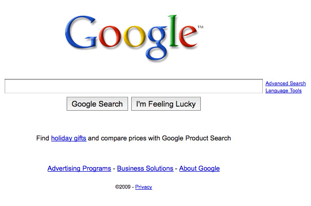
Let’s start off by having me show you the “world’s greatest landing page”. Anyone want to take a guess? Well if you cheated and looked, which I’m sure you did, it’s Google.

All joking aside, Googles landing page is fantastic. It’s straight to the point, clean and it’s gotten the job done for the past 10+ years.
What’s makes a landing page convert?
When you ask it that way there are so many elements that come into play. Here are just a few to consider:
- Design – Is your site design user-friendly?
- Copy – Does your copy do a good job of promoting your offer to your visitors?
- Layout – When I get to your landing page is the layout clean and concise?
- CTA (Call to Action) – Are you telling your visitors what to do?
- Leaks – Do you have extra links that will leak out your visitors?
If you have a current landing page, are you covering these areas? If so, where do you see improvement?
TIP: Rather than guessing what areas to improve on or to test, use your site analytics to determine where the bottlenecks are.
In my opinion, it’s not JUST having the sexiest design or the most persuasive copy. Remember to tie every element together. Also, having consistency from your paid search ad to your even your thank you page will never leave a bad taste in your customers mouth.
How hard is your current landing page working for you?
Ultimately, it also depends on what the goal of your landing page is.
- Are generating leads or selling a products?
- Is your lead gen page a simple lead form or do you require a credit card?
- If you’re selling products, do you have a low price point or high price point?
When you consider these types of things, you begin to understand your potential customer. Put yourself in their shoes. Would you fill out your lead form? What differentiates yourself from your competitors?
My Formula to Highly Converting Landing Page
Here’s a quick landing page “check list” of things you should consider with your landing page.
1. Competitive Analysis — Research your competition. See if there are any gaps currently not being filled. Find out what they’re offering. Bottom line though, research your competitors BUT don’t let your competition dictate what you do.
2. What’s your Offer? — From FREE Trials, FREE Shipping to Buy 1 Get 1 FREE, know what your offer is and stick to it. Don’t have a landing page that has multiple offers. It’s just straight up confusing.
3. Design/Creative — Let’s face it, we’re all not as talented as we’d like to think when it comes to pushing pixels. Just accept it and hire a freelancer to do it. Or if you have your in-house creative team let them tell you what looks best. There are 101 different landing page layouts. Avoid the design by committee and let the designer lay it out with what they think looks best. After you start collecting enough data you can test new layouts.
4. Development — Keep it simple stupid… for the user of course. Quick example, if you’re selling a product, be clear & concise. Your product should be displayed professionally with high-res images, wth a clear description and smooth checkout process.
5. Testing — Yes of course test your page for any bugs, but the testing I’m referring to is conversion testing. Consistent testing is crucial. From an entirely different layout to the color of your call to action button, testing will help you achieve a highr converting page.
[download]I want to put an emphasis on testing because I feel like conversion testing is just an after-thought to most. It’s completely under-utilized by most companies. C’mon people this is 2010 (close enough) and with all of the conversion testing tools at our fingertips, what are you doing?[/download]
6. Consistency — From start to finish. Same message. Same look and feel. Same offer. You get the point.
7. Miscellaneous Items — Here’s a few other random things in no particular order.
- Privacy Policy: You’d be surprised how many landing pages don’t let their visitors know what they do with their information and if it’s safe.
- Phone Number: I understand this can sometimes be a leak or you don’t have the luxury of a phone number but this allows your visitors the option of filling out your form or picking up the phone.
- Guarantee: 30 Day or Money-Back. Can you give your visitors a guarantee with your offer?
So there you have it. Short and sweet. If you’ve read this far I’m hoping it was valuable. If you have any additional ways to improve landings or anything worthy I can add to this post, let me know by leaving a comment. Also checkout my latest product, Weav to help supercharge your ecommerce marketing.
As always, be sure to Subscribe to my RSS Feed or Follow @jrfarr on Twitter and I’ll catch you on the flip side.